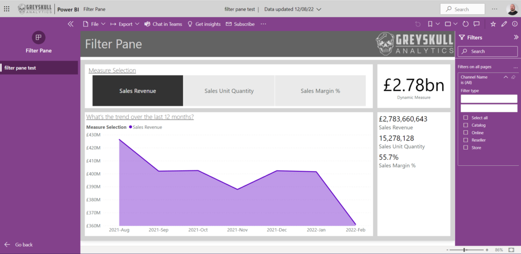
This blog is inspired by a poll I recently ran on Twitter about whether people hide the filter pane or not. It’s another one of those topics where I don’t feel there is a definitive right or wrong answer – yep, this is me fence sitting again. But as always, I’m happy to share my opinion and what my personal preference is, as well as the reasons why.
Before the filter pane
If you’re a seasoned Power BI user, then you may remember that once upon a time, there wasn’t even a choice. The original implementation of the filter pane was only available in Power BI desktop as part of the report authoring experience. Once content was published to the Power BI service this was automatically hidden and the only options available for end users to change the data displayed in the report were slicers or visualisation cross-filtering.
With many early adopters of Power BI coming from a Microsoft SQL Server Reporting Services (SSRS) background, this caused a bit of an outcry. SSRS users were accustomed to a parameter pane that end users set their report selections in and with canvas space in Power BI at a premium, filling the page with many slicers was using up precious room.
Responsive to the communities feedback, the Power BI product team introduced a new filtering experience at the end of 2018 (I’ve scoured the internet for a reference to this event and the earliest I found was this video from Curbal in November 2018 ).
The new filter pane
All rejoice! Filters could now be added to a page high collapsible pane on the right of the report, and this could also be made available for end users in the Power BI service to edit the selections made.
Well, not quite. Despite being amongst the crowds of people who bemoaned the lack of this feature originally, I’ve come to realise that I really dislike the filter pane and I hide it on all of my reports.
Why, I hear you ask? Well maybe, as an early adopter it might be partly to do with the fact that I just got used to managing without it. However, I’ll offer up a few more considered reasons
1. It’s ugly
Yes, beauty is in the eye of the beholder and I guess this reason is somewhat subjective, but I just don’t really like it. Yes, there are some formatting options, so you can change its appearance, but I still feel it looks cumbersome. I saw a very useful tip recently, shared by #SML member Sheila Hart, who recommended that if publishing reports as part of a Power BI app, you can format the filter pane to look as though it’s part of the app. I admit, this was a nice touch and does improve the aesthetic, but ultimately, I’m still not a fan.

2. It’s unintuitive
I just feel like the choice between basic and advance filtering gets a bit confusing. The advanced options in particular are a bit of a minefield, especially when you get into the realms of setting and/or conditions. Maybe I’m not giving enough credit to the ability of my end users, but I’d much rather that they interact with filtering options that are a bit more idiot proof. Having asked for opinions on the filter pane, I’m not the only person who shares this view.

3. It’s in the wrong place
There was a rumour at one point, that the positioning of the filter pane was going to become a customisable feature, but alas no, it’s stuck over on the right-hand side and often hidden. From a dashboard design point of view, we’re taught that the most important elements should be in the top left of a report and should either run across the top or down the left of the page. I’d argue that filter selections are VERY important elements. Setting and seeing your filter selections sets the context for the insights your end users will view in the report. So I think this should really be on the opposite side of the page.
As an end user myself, I even fell foul of the unintuitive placement of the filter pane myself this week; viewing a report that had been produced by a colleague I was desperate to filter the content and I messaged her to ask if would be possible for her to add a slicer, only to realise to my embarrassment afterwards that the very filter I wanted to apply was available to me in the filter pane.
Alternatives
So how do I allow my users to navigate and alter the content of their reports? Well slicers are an obvious first choice, but I’m also a fan of drill through pages that can pass filter context from a summary page through to a page with detail at a different level. And if I really, really do need filter pane-esque functionality, I’m more likely to create my own pop-out filter pane using bookmarks (like in this Guy In a Cube video)
But maybe there are some good reasons that the filter pane IS a good choice. Firstly, if Microsoft have gone to the trouble of developing the feature, surely we should be using it? …though to be fair, I think I’ll file this under the same category as auto-datetime and many-to-many relationships. Just because a feature DOES exist, doesn’t necessarily mean it’s a good choice to use it.
The best rationale I’ve seen was offered up by Kerry Kolosko:

Conclusion
So again, another Power BI topic that splits opinion. What I would encourage you to do is to give it some thought. If you’re consistent with your choices and understand the pros and cons of each approach, and why you’ve made the choice you have, either option is fair game.


1 Comment
Slicers vs. Slicer Pane vs. Filter Pane! Which is faster? - Guy in a Cube · August 25, 2022 at 3:05 pm
[…] Should you hide the filter pane in Power BI? https://greyskullanalytics.com/should-you-hide-the-filter-pane-in-power-bi/ […]